 Back
Back
Increased Class Sign-Ups by 27%
Fewer options can mean faster decisions and less hesitation. Who knew?
The Product
Financial Peace University (FPU) is a course that helps people get out of debt, offered both in-person and online.
The Problem
The business highlighted two major concerns:
- Class registration rates were low.
- Attendance dropped off after the second module of the class.
The Research
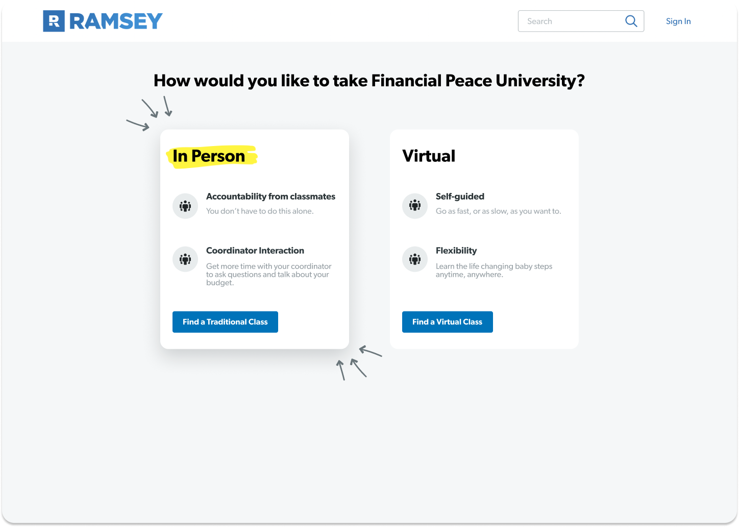
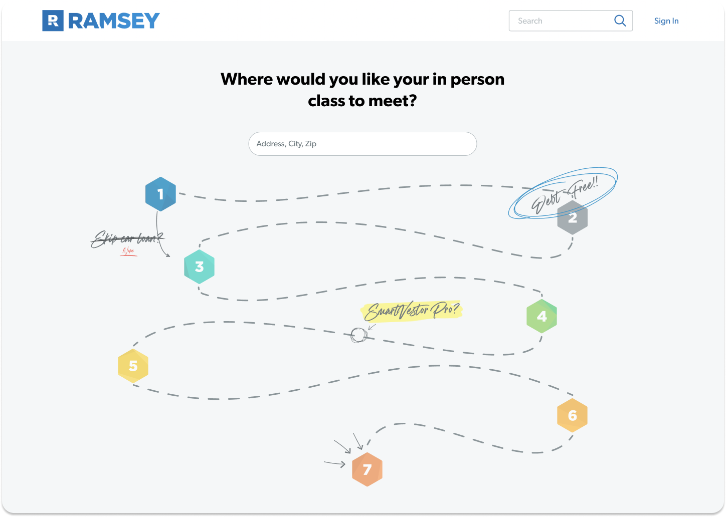
We mapped out the flow for joining a class:
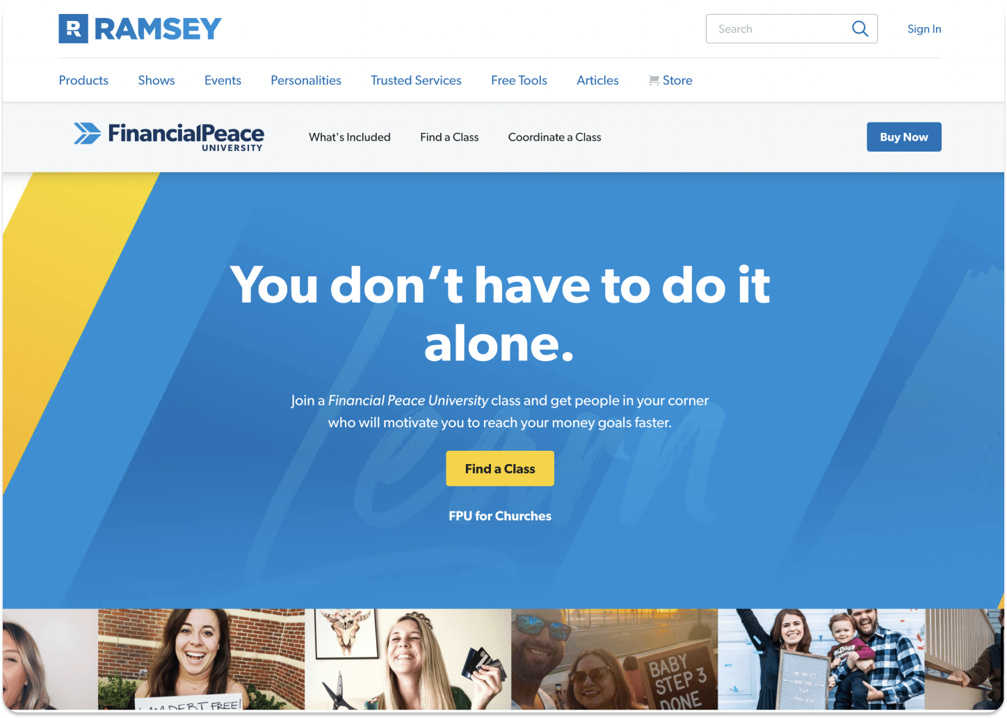
- Landing page
- Class type selection (in-person or virtual)
- Location search
- Class listings
Our metrics showed the biggest drop-off happened at step 4, the listings page.
The Opportunities
From our daily interviews, we heard:
- "I want better filters."
- "I want to know more about the instructor."
- "I want to sort by time or distance."
We played around with some of these lighter lifts, but all these lived on the listing page and possibly after people already dropped off.
Instead of making it easier to filter all classes to choose from, what if you only had a few?
The time it takes to make a decision increases with the number and complexity of choices.
People weren't stuck because they lacked info, they were stuck because there was too much of it.
The Hypothesis
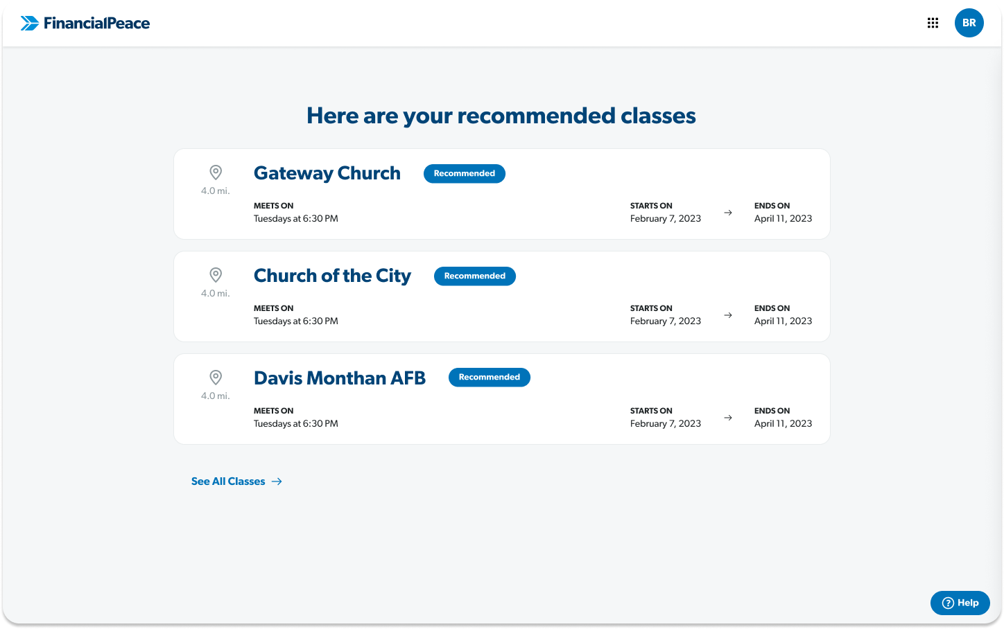
If we simplify the listings page by reducing the number of options shown up front, it might result in faster decisions.
The Solution
It was so simple it felt stupid.
Show 3 "recommended classes" before being dropped on the full listing page.
The Results
We rolled this out and validated our theory, people were registering faster and more often.
We saw a 27% increase in class registrations, which meant more people who were looking for help were finding it.
"Big problems are rarely solved with commensurately big solutions. Instead, they are most often solved by a sequence of small solutions, sometimes over weeks, sometimes over decades."
Extras
We also had a chance to refresh the entire flow and play with some other concepts that didn't make the cut, check it out!